Huey Suncare Website Redesign

Huey Suncare is a mineral sunscreen brand focused on helping athletes and outdoor enthusiasts protect against both UV damage and the often-overlooked effects of sun fatigue. While their original site acted more like a pitch deck than a shopping experience, founder Justin wanted to pivot the brand’s message to still cater to different skin tones, but with an added focus on reducing sun fatigue for active lifestyles. Over a four-week period as part of my Springboard Industry Design Project, I helped redesign Huey’s website to better educate customers, improve navigation, and introduce a personalized “Find Your Hue” quiz, creating a clearer, more engaging e-commerce experience that connects the right product to each user’s unique needs.
Overview
Timeframe: 4 weeks
Role: Group Lead, UX Designer, UX Researcher
Tools: Figma, Google Docs, Miro
Team Members: Danny Truong, Emily Sayer, Henri Ni, Ireland Mak
Competitive Analysis
To gain some inspiration about how we wanted to design the website, my team conducted a competitive analysis on a variety of different sunscreen/skincare brands: Supergoop!, Banana Boat, Curology, Cerave, Beauty of Joseon, etc.
Takeaway:
1. Many of these websites have a simple, clear quiz to help their consumers find the right product for them.
2. Show what makes your product special/different on the homepage. It's important to show why people should be buying your product versus another brand.
3. Be aware of information overload. Even if you want your consumers to know more about your product, be wary about how and how much information you put on a single screen.
Research Question
With these research insights in mind, we wanted to focus on helping Huey stand out by creating a more personalized and educational shopping experience. This led us to our guiding question:
How might we guide users (performance athletes/individuals) who are unfamiliar with suncare toward personalized product recommendations that fit their skin and lifestyle needs?
User Flow
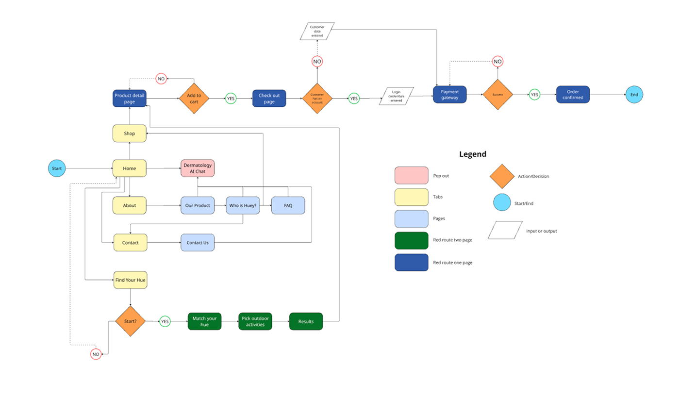
To address our research question, we mapped out a user flow focused on guiding visitors from the homepage to all of our different sections of our website, including the about page, Find Your Hue quiz page, and the main shop page.
All of these pages work synchronically since we want our users to understand the product, find the product that works best for them, and then help them purchase them.

User Flow for the new redesigned Huey website
Site Map
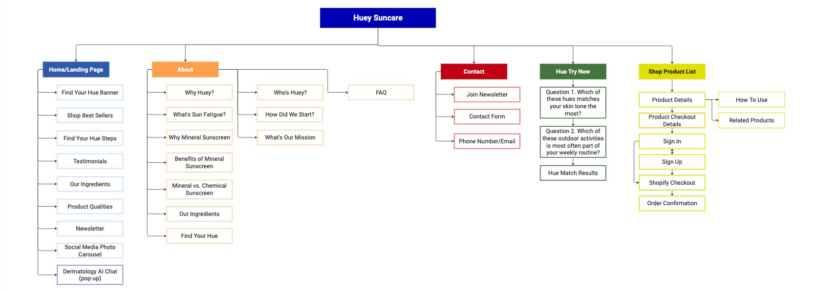
After creating our user flow, we still needed to determine what type of information we wanted to display on each page and how it should be organized for clarity and ease of navigation. The original site lacked clear content structure, making it difficult for users to find the information they needed.
In our redesigned site map, we defined key pages such as Home, About, Contact, Find Your Hue, and Shop, and mapped out the essential content for each. This ensured that users could quickly understand Huey’s value proposition, explore products, learn about sun fatigue, and get personalized recommendations through the quiz. By organizing the site this way, we created a straightforward and engaging path for both new and returning visitors.

Site Map of the new Huey's website
Wireframes/Low-Fidelity Prototypes
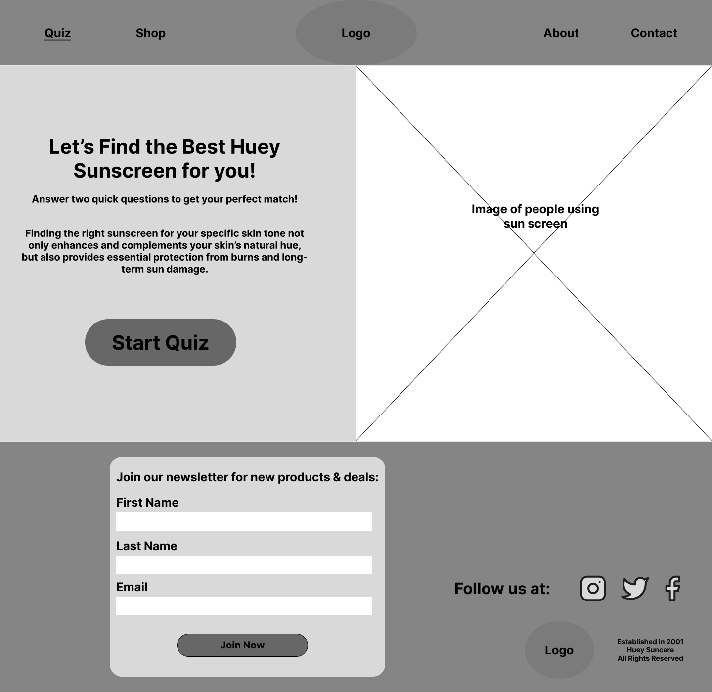
With the site map finalized, we moved into wireframing to translate the structure into a visual layout. Starting with low-fidelity wireframes, we focused on content placement, hierarchy, and user flow without getting distracted by colors or typography. This allowed us to quickly test and adjust the arrangement of elements like the hero section, navigation bar, product cards, and quiz prompts. During this process, things were constantly being changed and it was hard to decide which idea we all wanted to go with.

Early Home Page: Early rendition of what the homepage will look like

Early Quiz Page: Initial layout of the "Find Your Hue" quiz, focusing on text and image placement

Early Shop Page: Initial structure for the product listing page, outlining the product card placement
High-Fidelity Prototype
Once the layout felt intuitive, we moved into high-fidelity wireframes, incorporating Huey’s brand colors, typography, and imagery. These higher-fidelity versions helped us refine spacing, visual balance, and interactive elements such as buttons and product filtering. By iterating from low to high fidelity, we ensured the design was both functional and visually aligned with Huey’s mission.

Final Homepage: Captures the client's brand and showcases the product effortlessly

Final Quiz Page: This page is eye-catching and straight to the point

Final Shop Page: Allows users to view the main products and choose which product to purchase
Interactive Prototype
After refining our high-fidelity wireframes, we developed a fully interactive prototype in Figma to bring the redesigned Huey website to life. The prototype allowed us to simulate real user interactions, from navigating the homepage to completing the “Find Your Hue” quiz and checking out.
Reflection
This project was a valuable opportunity to apply the full UX process to a real client challenge. Working with Huey Suncare pushed me to think critically about how branding, product discovery, and e-commerce intersect to create a more engaging user experience. I learned the importance of grounding design decisions in research, as our competitive analysis and user flow mapping directly informed the site’s structure and features.
If I were to revisit this project, I would conduct more user testing earlier in the design phase to validate our assumptions and uncover additional usability improvements. I would also run a few usability tests near the end to ensure the website flows smoothly and avoids user confusion. Overall, I’m proud of my team and how our redesign not only clarified Huey’s brand message but also provided users with a clear path to finding products that fit their skin tone and lifestyle needs.


