GottaGo:
Improving the Group Trip Planning Experience
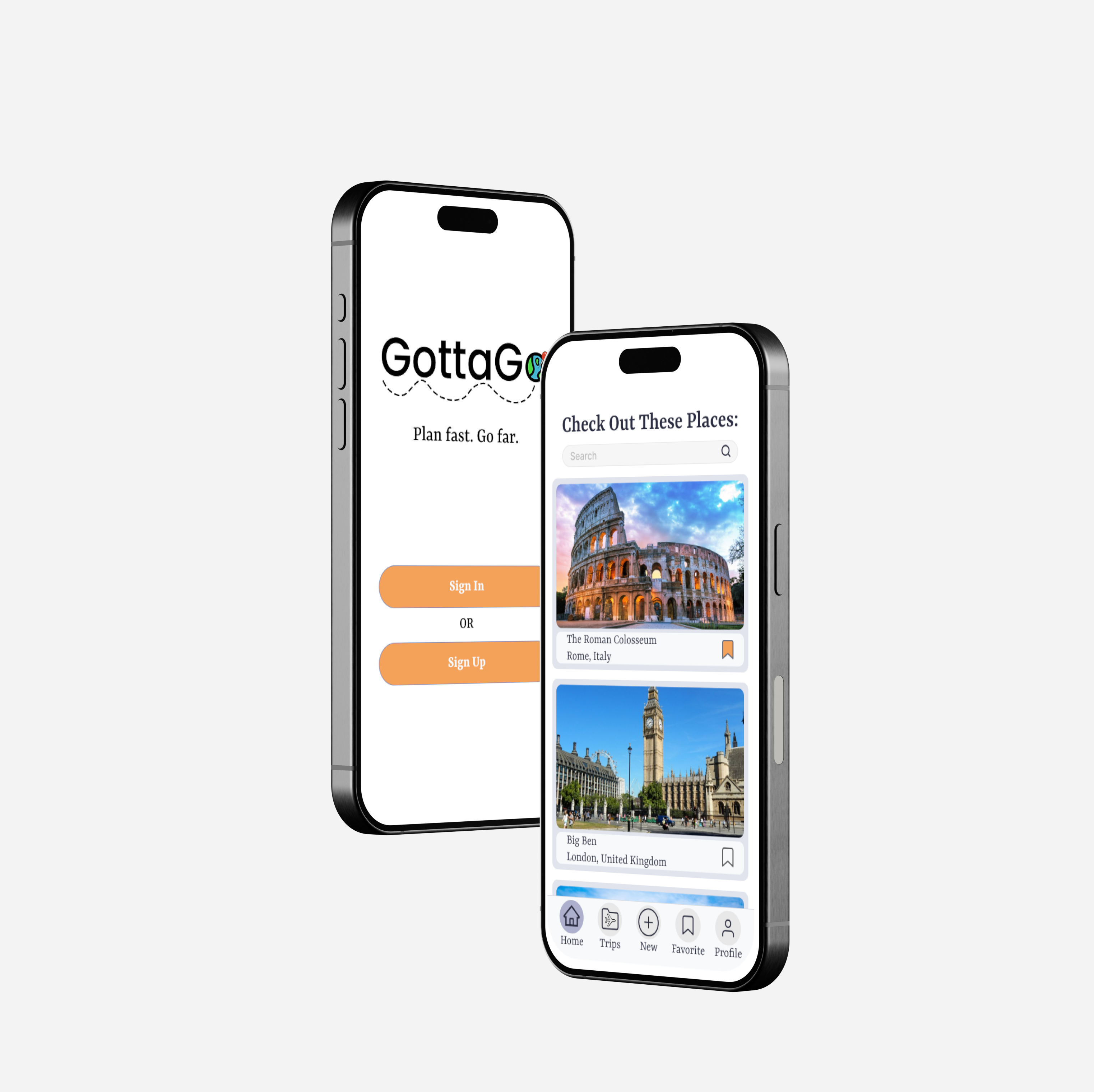
GottaGo is a mobile application designed to help simplify the challenges and frustrations of planning a group trip. Coordinating dates, managing budgets, tracking preferences, and keeping everyone on the same page can quickly become tiring, especially when you have to use multiple tools.
To solve this, I designed GottaGo: an all-in-one itinerary planning app that helps users organize trips collaboratively in one place. From group decision-making and budget tracking to activity proposals and reservations, GottaGo is the solution to make the experience of planning a group trip smoother and easier for everyone.
Overview
Timeframe: 6 months
Role: UX Designer / Researcher
Tools: Figma, Google Docs, Miro, Milanotes
Team Members: Danny Truong
Assumption of the Problem
Planning group trips can often be frustrating and confusing. People frequently face difficulties such as coordinating schedules, agreeing on activities, and keeping track of multiple reservations and expenses. These issues can lead to miscommunication, tension, and decision fatigue within the group. While the act of traveling is seen as enjoyable, the process of organizing, planning, and facilitating can easily become a source of stress rather than excitement.
Research: Understand the Problem
While my initial assumptions helped me define a starting point, I wanted to hear directly from users to understand what planning a group trip is actually like. I focused my research on uncovering the tools people use, the challenges they face, and where the planning process breaks down.
○ Secondary research on group trip planning behaviors and existing solutions
○ Competitive analysis of Google Docs, TripIt, and Wanderlog
○ Screening survey to recruit experienced group trip planners
○ 3–5 in-depth user interviews
Key Findings
1. Fragmented planning creates stress:
Across research methods, I found that group trip planning is highly fragmented. People rely on multiple tools to handle different parts of the process, which leads to confusion, miscommunication, and burnout before the trip even begins. No single platform fully supports the planning journey from start to finish.
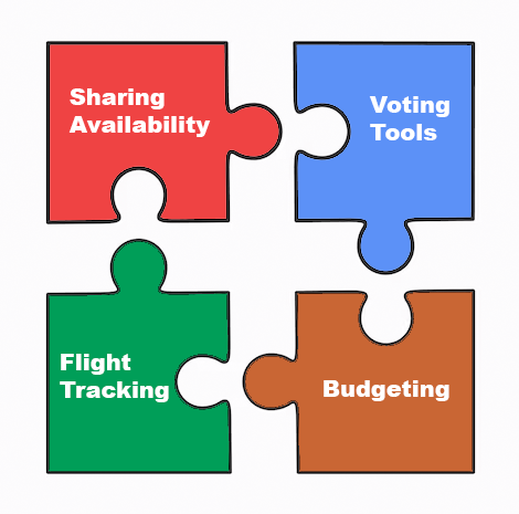
Represenation of Fragmented Planning: separate apps each solve part of the process, but no single tool supports the entire journey.
2. Existing tools only solve part of the problem:
○ Google Docs is flexible and familiar, but requires users to build everything from scratch.
○ TripIt offers a more guided experience, but is primarily designed for solo planning.
○ Wanderlog includes many features, but its interface can feel overwhelming and difficult to learn.
Each tool does one or two things well, but none support group trip planning in a convenient and enjoyable way.
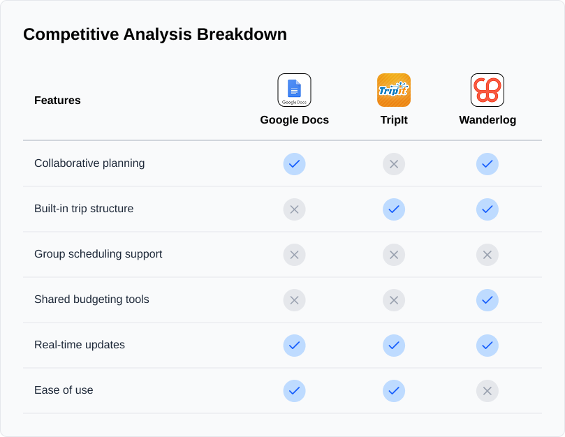
Side-by-side comparison of feature availability across three travel planning platforms.
3. Scheduling and coordination are the biggest pain points
Survey responses showed that planners often struggle most with coordinating schedules, managing budgets, and keeping everyone aligned. Many expressed a desire for a simple, collaborative tool with real-time updates and visually clear features.
4. Group trip planning is emotionally taxing
User interviews revealed that planning trips as a group is more emotional than expected. Participants described anxiety, frustration, and social tension, especially when juggling multiple tools and responsibilities. While planning styles varied, everyone shared a need for flexibility, transparency, and better communication.
Design Implications
These insights shaped my focus on designing an all-in-one, collaborative experience that:
○ Reduces tool-hopping by centralizing planning tasks
○ Supports flexible planning as plans and preferences change
○ Makes coordination, responsibilities, and decisions clearer for the entire group
Analysis: Connecting the Dots
After conducting research, I synthesized my findings to identify patterns, emotional drivers, and clear product opportunities. This phase helped translate raw data into focused design direction.
I organized these interview findings into five themes:
Personal Experience, Tools Used, Usage of Itinerary, Difficulty Planning Itinerary, and Like/Want for Itinerary.
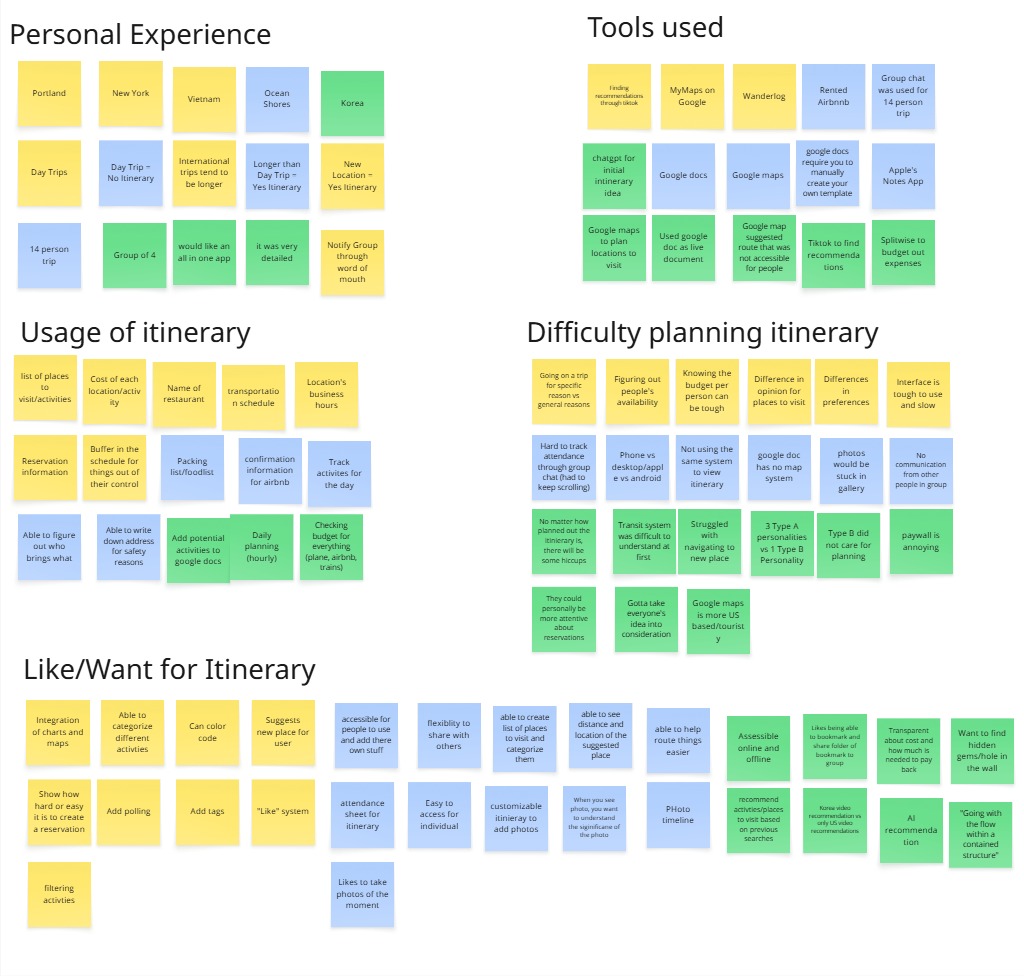
Affinity map of my notes from the interviews categorized by their similarities.
Each category had their own insights that I was able to utilize in my application:
1. Planning styles vary based on trip length, group size, and personality (Type A vs Type B).
2. Users rely on multiple tools (Docs, Maps, TikTok, Splitwise), leading to constant app-switching.
3. Itineraries are used to coordinate schedules, responsibilities, transportation, and budgets.
4. Miscommunication, last-minute changes, and unclear responsibilities create tension.
5. Users want an all-in-one, collaborative tool with templates, polling, personalization, and AI recommendations.
Insight:
○ Fragmentation and coordination stress are the core problems, not itinerary creation itself.
Empathy Map
I created two empathy maps to distinguish between short/day trip planners and long trip planners.
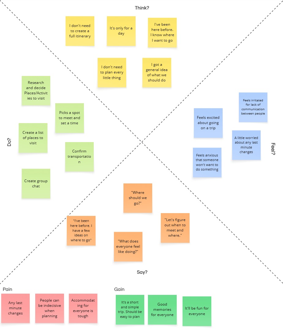
Empathy map for users planning a short/day trip.
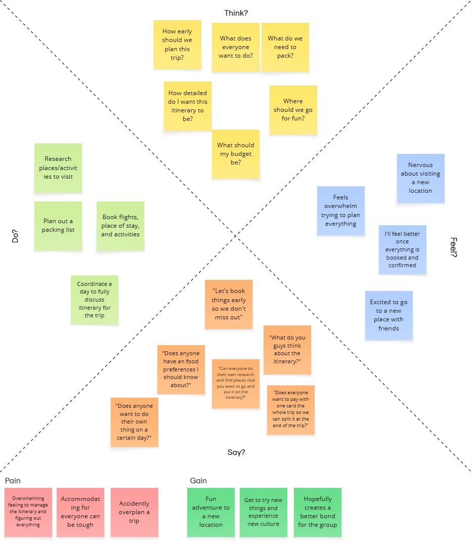
Empathy map for users planning a long trip.
Key Takeaways:
Short Trips
○ Need quick, low-effort planning tools
○ Value flexibility and spontaneity
○ Prefer lightweight structure
Long Trips
○ Require deeper organization and shared input
○ Experience higher mental load
○ Need collaborative tools, budgeting support, and adaptability
Insight:
○ Trip length significantly changes user needs. The product must have a balance between simplicity and depth.
User Personas
I developed two personas:
Jason (Day Trip Planner)
Camila (Long Trip Planner)
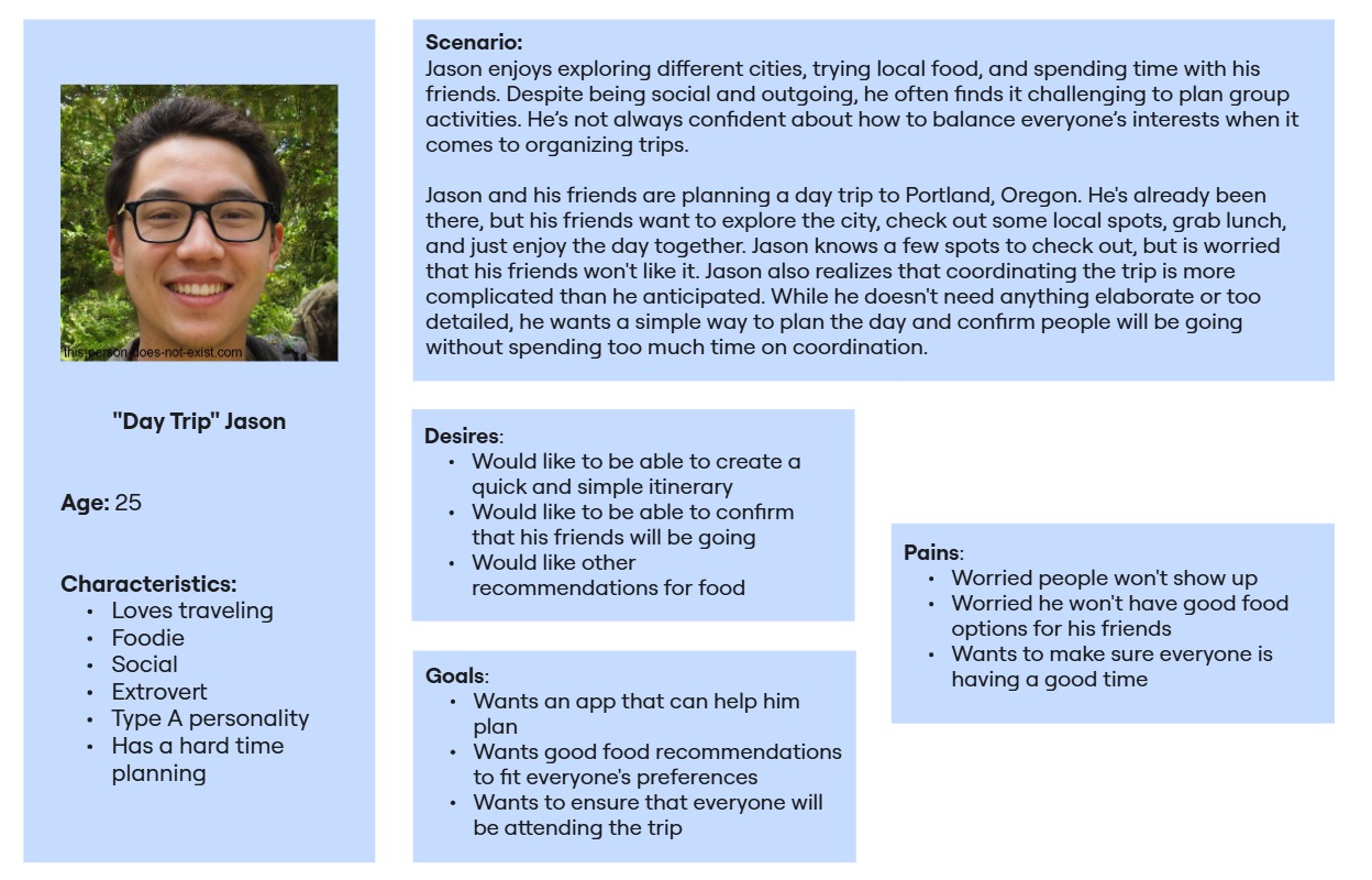
User Persona for "Day Trip" Jason.
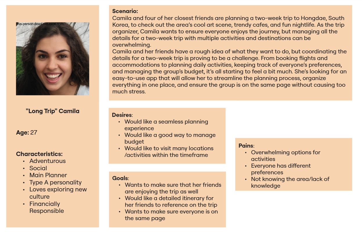
User Persona for "Long Trip" Camila.
These personas grounded the design in real behaviors and highlighted that:
○ Short trips require speed and coordination.
○ Long trips require structure, budgeting, and shared decision-making tools.
Defining the Problem
From these insights, I framed three core questions:
1. How might we improve the usability and functionality of existing travel planning apps to meet the diverse needs of users?
2. How might we create a more personalized and flexible travel planning experience for different types of travelers?
3. How might we design a planning tool that balances simplicity for day trips and depth for longer journeys?
User Story & MVP Definition
I translated insights into user stories and grouped them into four categories:
1. Keeping the group aligned
2. Managing money
3. Planning collaboratively
4. Exploration
While many features were possible, users primarily struggled with:
○ Coordinating decisions
○ Agreeing on destinations
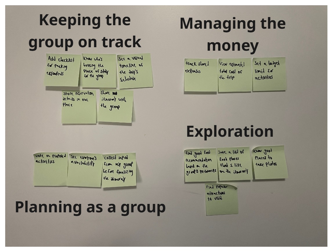
User Stories that were categorized into specific groups.
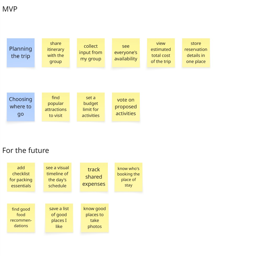
MVP from my User Stories and future features to be iterated.
MVP Focus
I prioritized two key flows:
1. Storing and editing reservation details
2. Proposing and deciding on activities
This ensured the first version addressed the most immediate user pain points before expanding further.
User Flow
I designed user flows around the two MVP paths to ensure interactions were intuitive and aligned with user decision-making. Rather than focusing only on screens, I mapped how users think, decide, and coordinate at each step to reduce friction.
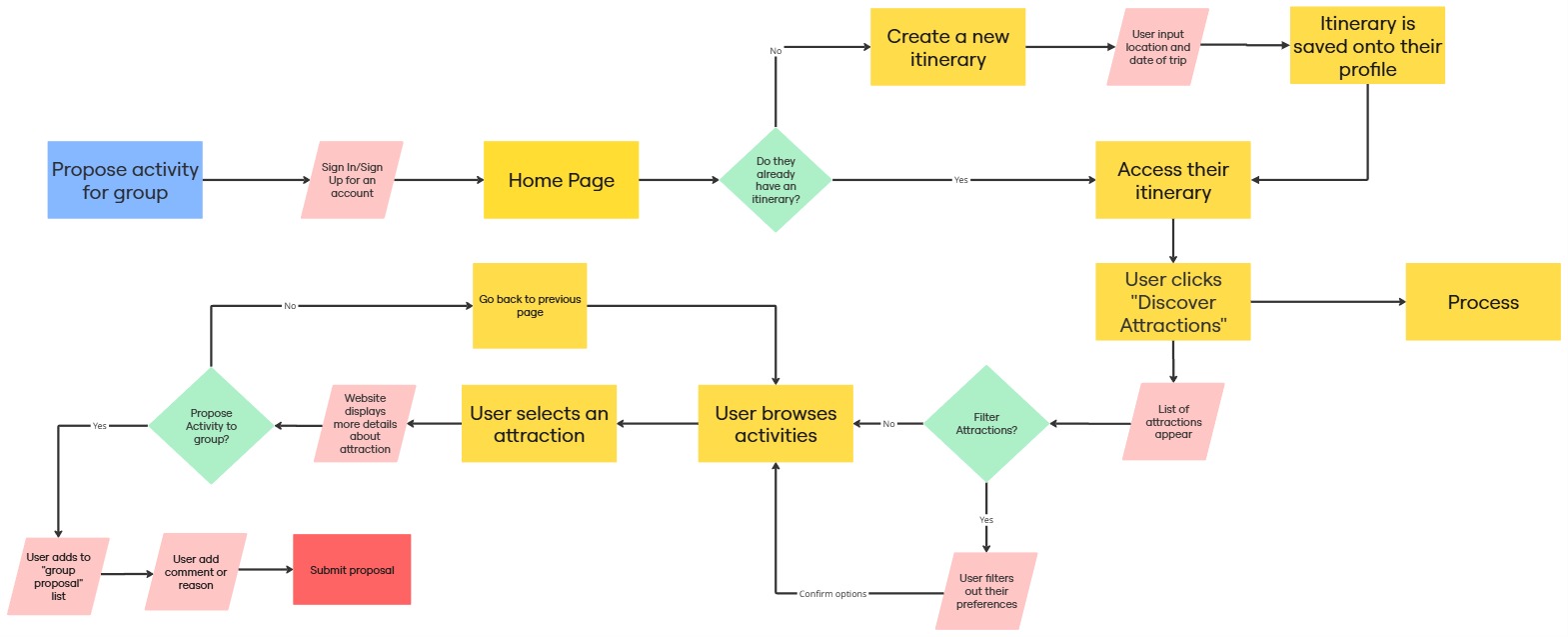
User Flow for the MVP: Propose Activity for Group
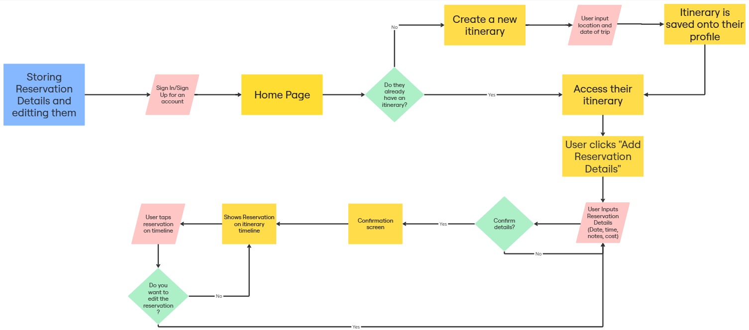
User Flow for the MVP: Storing Reservation Details and Editing them.
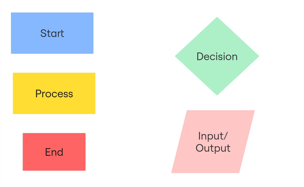
Key/Legend for each represented shape.
Early Iterations
With clear research insights, I began translating user needs into tangible solutions. My focus was reducing coordination friction while keeping planning flexible for different trip types.
Sketches
I started with hand-drawn sketches to quickly explore layout ideas, navigation patterns, and feature placement. Working low-fidelity allowed me to iterate rapidly and incorporate mentor feedback before investing in high-fidelity design.
Through sketching, I refined:
○ Navigation structure
○ Feature prioritization
○ Core planning flow clarity
These early iterations helped simplify the experience before moving into digital prototypes.
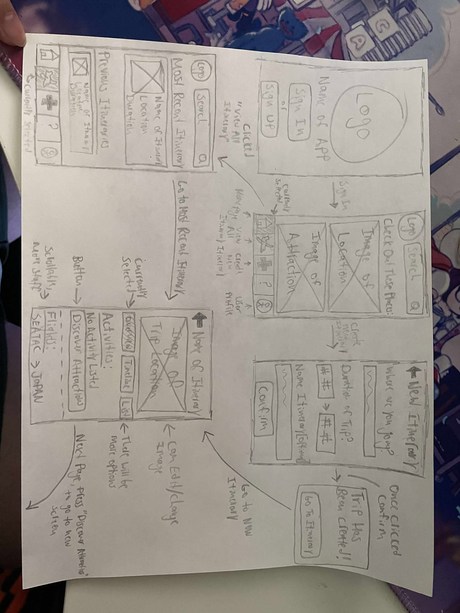
Sketches of GottaGo including the homepage, main itinerary screen, and more.
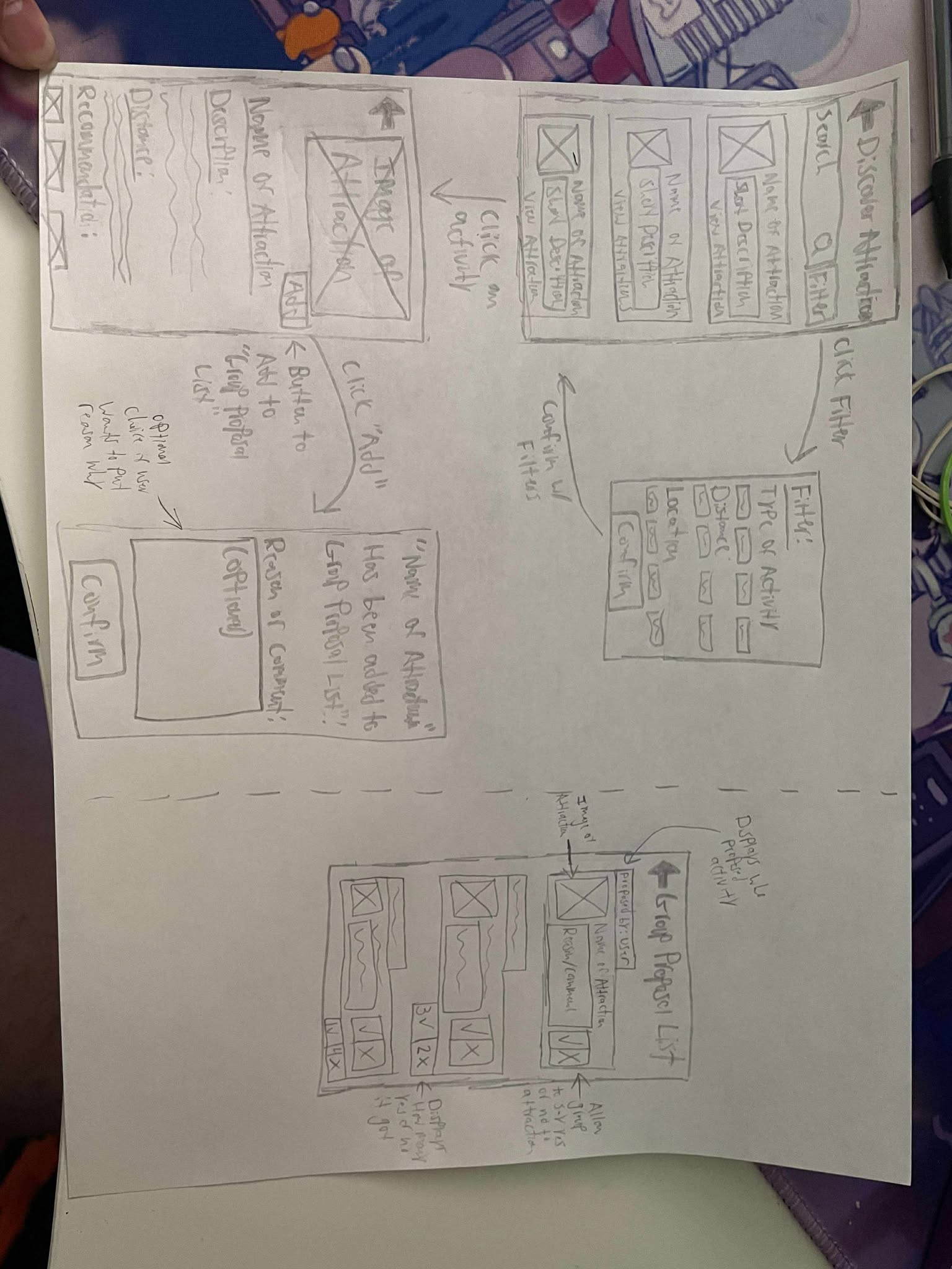
Sketches of GottaGo including the attractions page, group proposal list, and more.
Prototyping & Validation
I created a low-fidelity prototype to validate structure, navigation, and screen hierarchy. This stage focused purely on usability and flow, allowing me to test how users moved between key tasks without visual distractions.
High Fidelity Prototype
After iterating on structure, I developed a high-fidelity prototype to evaluate visual hierarchy, interaction clarity, and overall usability. This version simulated a realistic experience and was used for usability testing.
The goal was to ensure that visual design supported coordination, clarity, and collaboration — not just aesthetics.
Interactive Prototype
Interactive Prototype for GottaGo.
Usability Tests
I conducted two rounds of usability testing with six participants. Each participant completed specific tasks such as:
1. Creating an itinerary
2. Proposing activities to the group
3. Entering expenses
4. Editing reservations
After testing the first version, I implemented revisions and validated improvements in a second round.
Key Findings & Iterations
1. Swipeable Tab Bar Confusion
Issue: Users did not recognize the tab bar as swipeable.
Action: Explored alternative navigation cues and clearer interaction indicators.
Insight: Discoverability matters more than aesthetic minimalism.
2. Lack of Negative/Neutral Option in Group Proposal List
Issue: Users wanted a way to express disinterest in activities.
Action: Reconsidered interaction design to allow clearer feedback without creating social tension.
Insight: Designing for group dynamics requires balancing clarity and emotional sensitivity.
3. Disconnected Task Flow
Issue: Moving between “Add Activity” and “Group Proposal List” felt inefficient.
Action: Added quicker navigation pathways to reduce back-and-forth friction.
Insight: Micro-interactions significantly impact perceived efficiency.
Reflection and What is Next
This project helped me realize how emotionally complex group planning can be. Different personalities, planning styles, and trip lengths all influence what users need from a tool.
One of my biggest takeaways was how important clarity and discoverability are. Features that seemed obvious to me were not always obvious to users. Testing reminded me to design based on real behavior, not assumptions.
If I continued developing GottaGo, I would:
○ Implement and re-test navigation improvements
○ Expand budgeting and coordination features
○ Conduct additional rounds of usability testing with larger groups
More than anything, this project reinforced that iteration is essential. Even when a design feels complete, there is always room to improve based on how users actually interact with it.