GottaGo:
Improving the Group Trip Planning Experience
GottaGo is a mobile application designed to help simplify the challenges and frustrations of planning a group trip. Coordinating dates, managing budgets, tracking preferences, and keeping everyone on the same page can quickly become tiring, especially when you have to use multiple tools. To solve this, I designed GottaGo: an all-in-one itinerary planning app that helps users organize trips collaboratively in one place. From group decision-making and budget tracking to activity proposals and reservations, GottaGo is the solution to make the experience of planning a group trip smoother and easier for everyone.
Overview
Timeframe: 6 months
Role: UX Designer / Researcher
Tools: Figma, Google Docs, Miro, Milanotes
Team Members: Danny Truong
Assumption of the Problem
Planning group trips can often be frustrating and confusing. People frequently face difficulties such as coordinating schedules, agreeing on activities, and keeping track of multiple reservations and expenses. These issues can lead to miscommunication, tension, and decision fatigue within the group. While the act of traveling is seen as enjoyable, the process of organizing, planning, and facilitating can easily become a source of stress rather than excitement.
Research: Understand the Problem
While my assumptions gave me a starting point, I knew I needed to hear directly from users to understand the full picture. What do people actually struggle with when planning a trip? What tools do they use? These were the questions that guided my research.
To better understand the challenges of group trip planning, I began by conducting secondary research. This helped me uncover who experiences these challenges, how they are affected, and what solutions currently exist.
As a result, users are forced to handle multiple tools, which can add stress and confusion. This fragmented process often leads to miscommunication, indecisiveness, and burnout even before the trip begins. A more unified, all-in-one solution could help people feel more excited and less overwhelmed about group travel.
Biggest issue found:
No single platform can completely support the entire planning journey from start to finish.
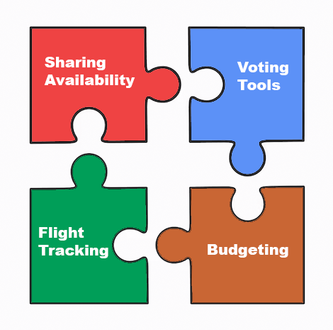
Represenation of Fragmented Planning: separate apps each solve part of the process, but no single tool supports the entire journey.
As a result, users are forced to handle multiple tools, which can add stress and confusion. This fragmented process often leads to miscommunication, indecisiveness, and burnout even before the trip begins. A more unified, all-in-one solution could help people feel more excited and less overwhelmed about group travel.
Competitive Analysis
I conducted this competitor analysis to better understand how existing tools are currently helping people plan trips, and where they still fall short. By exploring applications like Google Docs, TripIt, and Wanderlog, I wanted to see how each one approaches itinerary planning, what features they offer, and what the user experience is like. Reading through reviews and trying out tools myself helped me identify both their strengths and weaknesses. This helps uncover opportunities to design a more complete, convenient, and user-friendly experience that actually supports how people want to plan group trips.
Each of the apps I reviewed tackled travel planning in their own unique way, but none of them fully supported the entire process in a smooth or convenient way.
• Google Docs is extremely flexible and accessible, but it relies entirely on users to build everything from scratch. While the minimalist design is familiar, the lack of built-in prompts or templates means users do a lot of the heavy lifting themselves.
• TripIt offers a more guided itinerary builder with simple, recognizable icons and a clean design. However, it focuses mainly on solo or individual itinerary building, and it doesn’t feel very engaging or collaborative for group planning.
• Wanderlog tries to do it all, offering a wide range of features like adding flights, accommodations, and activities, but the interface ends up being overwhelming. With too many elements packed into one screen and a steep learning curve, it can be confusing for users who want something more intuitive.
What I noticed across the board is that each app does one or two things well, but none of them solve the full problem of group trip planning in a streamlined and enjoyable way. There’s a real opportunity to combine the best parts of these tools into one app that’s both functional and friendly to use.
Screening Survey
I conducted a screen survey to help identify the right people to interview. Specifically, those who have firsthand experience planning group trips. The goal was to filter out participants who weren’t directly involved in planning, and instead focus on individuals who could provide valuable insights into the tools they use, the frustrations they face, and the features they wish existed. By understanding these users better, I can design a solution that directly responds to their needs.
The survey was distributed across many relevant online communities, such as Facebook and Reddit, and remained open for about a week. I aimed to collect 10-20 responses, and at the end of the survey, invite people to participate in a follow-up interview. From the response, I would select 3-5 individuals who met my criteria and seemed like they could offer useful perspectives.
Ideal Participant Criteria:
1. Must be the main planner or have actively helped in planning
2. Must have experience planning at least 2 group trips
3. Group size must be 3 or more people
4. Must have used tools or applications to assist in the planning process
The survey showed that while group trip planners commonly use tools like Google Docs, messaging apps, and Airbnb, they often juggle between multiple platforms to stay organized which leads many people to feel confused and overwhelmed. The biggest challenges included coordinating schedules, budgeting, and keeping everyone on track. Respondents expressed a clear desire for a simple, user-friendly solution that supports collaboration, real-time updates, and visually clear features to make the group trip planning experience better.
User Interviews
The goal of these interviews was to deeply understand the emotional and logistical struggles that come with planning group trips. Interviews offer a way to hear real stories and experiences in more detail. I wanted to better understand the mindset, frustrations, and preferences of a typical user using an itinerary app. I did not just want to know what tools they were using, but how they felt while using them and what they wished existed. Through these interviews, I was able to gather relatable and beneficial stories that revealed many issues that can come across while planning these group trips. Each participant had different methods for organizing, coordinating, and planning, but they all shared common frustrations, such as a lack of unified tools, difficulty coordinating with others, and the mental load of keeping everything organized and equal. My participants also shared their wants for better communication, personalization, and aesthetics. The result of these interviews help build a better understanding for what an ideal group planning application should have, which includes flexibility, transparency, and meaningful recommendations.
Some of the insights that I have learned from the interviews were:
• Planning as a group is more emotional than it seems. Even with detailed planning, people still experience anxiety, frustrations, and social tension.
• People are using multiple tools for the same purpose, but wish they didn’t have to. Everyone said they wished one app could do everything from planning routes and splitting expenses to saving bookmarks and sharing responsibilities. The fragmentation of these apps have caused some frustration and extra work for the group.
• Flexibility is key, both in planning and in the interface. Everyone talked about situations where plans change or group members wanted to do their own thing. They needed tools that accommodate flexibility, from different preferences to noting who’s doing what.
Analysis
After gathering data through secondary research, competitor analysis, surveys, and interviews, I synthesized my findings to identify key patterns and user needs. This analysis phase helped me turn raw insights into actionable design opportunities.
I created an affinity map to organize and make sense of the information gathered from my user interviews. My notes were sorted into five main categories: Personal Experience, Tools Used, How They Use the Itinerary, Difficulties while Planning, and Wants/Needs in an Itinerary App. These groupings allowed me to see patterns across users’ behaviors, frustrations, and wants. By grouping similar pieces of feedback together, I was able to better understand the core challenges users face when planning group trips. This organization helped highlight where current tools fall short, what users prioritize when building itineraries, and what features they wish existed.
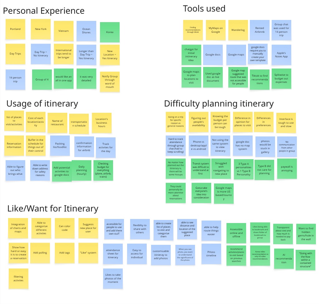
Affinity map of my notes from the interviews categorized by their similarities.
Each category had their own insights that I was able to utilize in my application:
• Personal Experience: Users approach group trips with different planning styles based on group size, familiarity with the destination, and their own personality types (Type A vs Type B)
• Tools Used: Popular tools included Google Docs, Google Maps, TikTok, and Splitwise. However, no single tool can cover all needs making users constantly have to switch between apps.
• How They Used the Itinerary: Most used their itinerary to schedule activities, track transportation times, coordinate group responsibilities, and monitor budget.
• Difficulties While Planning: Common struggles included miscommunication in group chats, last-minute dropouts, and unfamiliar transportation systems.
• Wants/Needs in an Itinerary App: Users expressed strong interest in an all-in-one app that combines planning, mapping, group coordination, and AI recommendations. They wanted features like customizable templates, poll-based decision making, and filters based on group preferences.
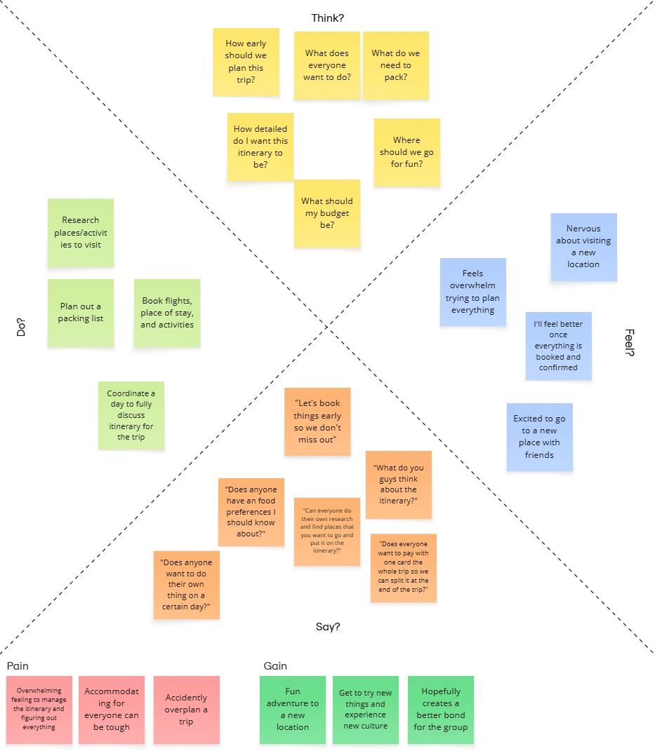
Empathy Map
I created two empathy maps to better understand the emotional and behavioral states of users when planning group trips. One map focuses on day/short trip planners, and the other on long trip planners. Creating these maps helped me visualize what users would say, think, do, and feel during their itinerary planning process.
Creating these empathy maps allowed me to deeply step into the shoes of my users and identify their needs, emotions, and pain points during the planning experience. Breaking it down into short vs long trip categories revealed important differences in user behaviors that can help me design features that cater to my user needs.
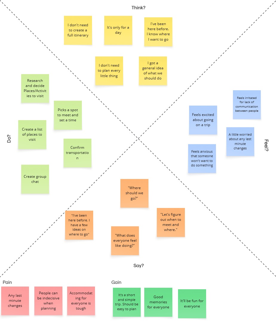
Empathy map for users planning a short/day trip.
Empathy map for users planning a long trip.
Insights:
Key Takeaway (short trip): Short trip planners need quick, low-effort planning tools. They value flexibility and spontaneous discovery but still appreciate a good structure to stay on track.
Key Takeaway (long trip): Long trip planners need tools that support proper organization, shared input, and adaptability. Mental load is heavier, so collaborative planning features and checklists can ease the burden.
User Personas
I created two personas, “Day Trip” Jason and “Long Trip” Camila, to represent the different types of users who might interact with an itinerary planning app. Jason represents someone planning a simple, short-term day trip, while Camila embodies the more complex needs of someone organizing a long group trip abroad. These personas help humanize user goals and frustrations, making it easier to design solutions that address real-life scenarios.
The goal of creating personas was to ground my design process in realistic user behavior, motivations, and challenges. By combining key findings from my user interviews, I created personas that illustrate two different travel planning mindsets. These personas help keep the focus on what users truly need, rather than relying on our assumptions.
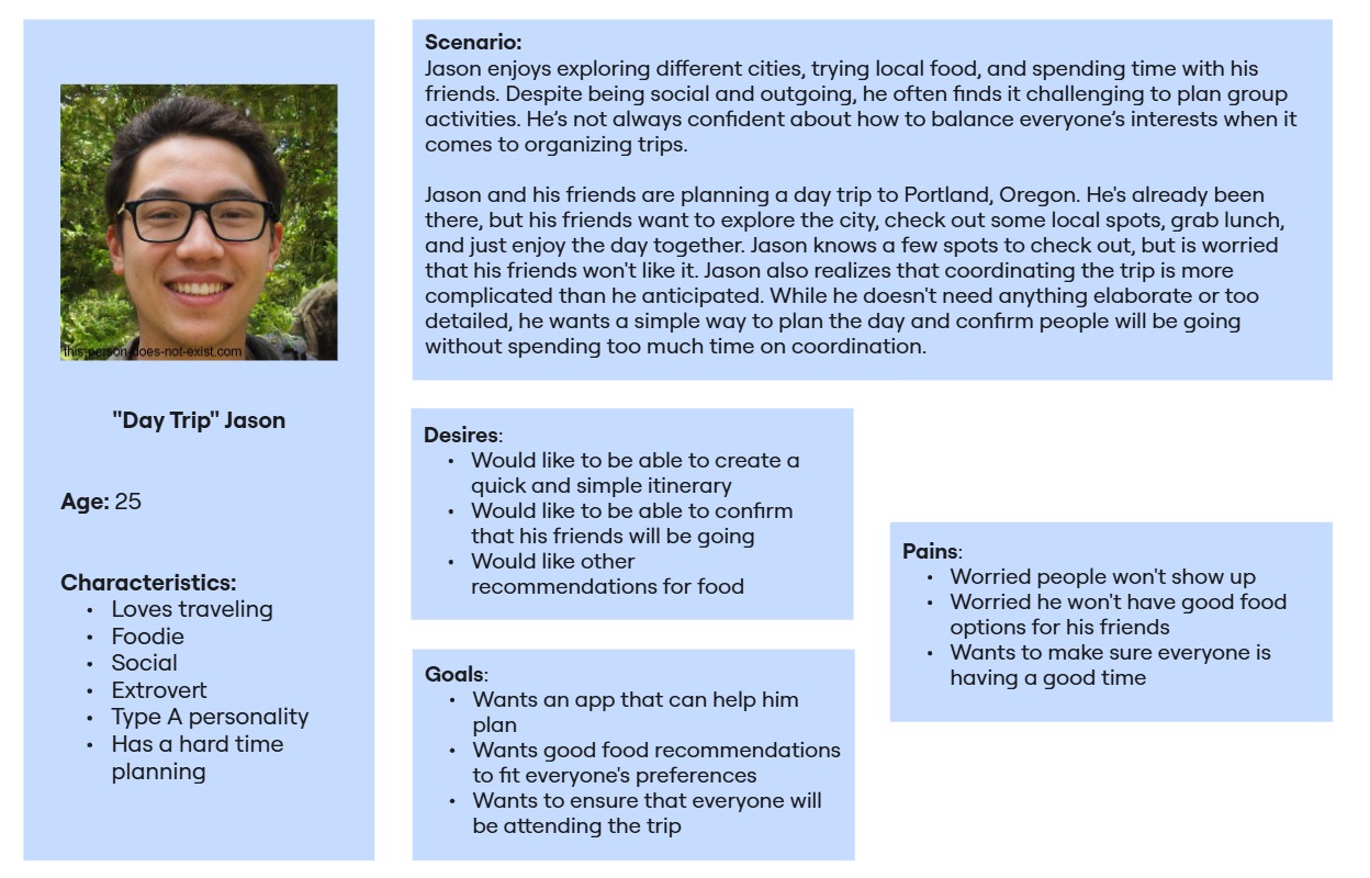
User Persona for "Day Trip" Jason.
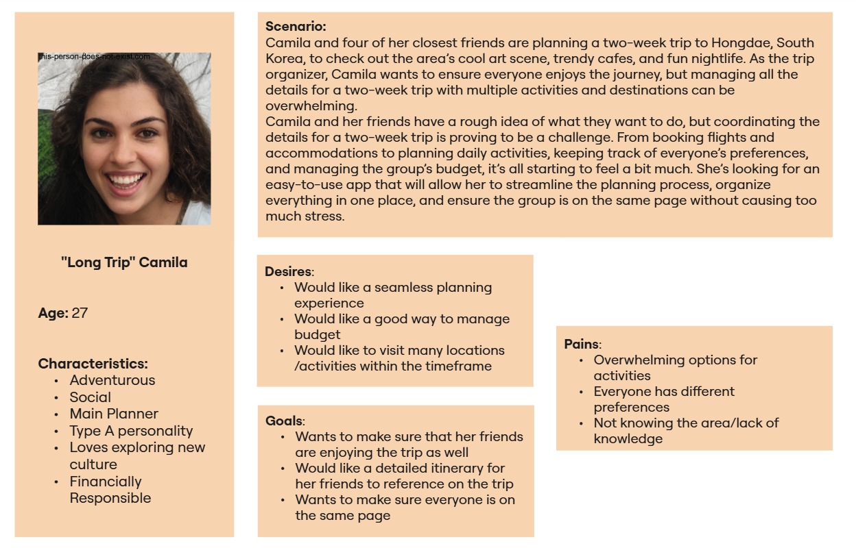
User Persona for "Long Trip" Camila.
While building these personas, I learned that trip planning challenges vary depending on the trip length and the group dynamic.
Short trips like Jason’s require quick coordination tools and light planning support. Users want efficiency and ease.Longer trips like Camila’s demand more advanced tools to manage budgeting, group coordination, and organizing multiple activities over time.
"How Might We" Statements
1. How might we improve the usability and functionality of existing travel planning apps to meet the diverse needs of users?
2. How might we create a more personalized and flexible travel planning experience for different types of travelers?
3. How might we design a planning tool that balances simplicity for day trips and depth for longer journeys?
User Story
I created user stories to better define the problem from the user’s perspective and to stay focused on solving real needs. By outlining what users want to do and why, I was able to prioritize features that truly matter and begin building from the user’s most pressing challenges.
The result is a refined list of user needs that helped me identify essential features and define a clear Minimum Viable Product (MVP). I categorized potential features into four groups: Keeping the group on track, managing the money, planning as a group, and exploration. From here, I selected two key MVP paths: planning the trip and choosing where to go. These align directly with the core struggles users face when organizing itineraries with others.
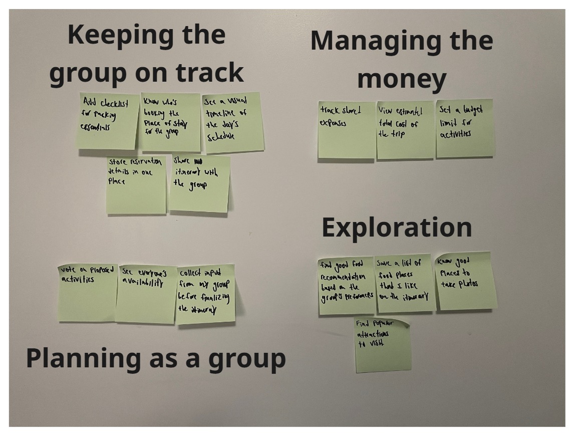
User Stories that were categorized into specific groups.
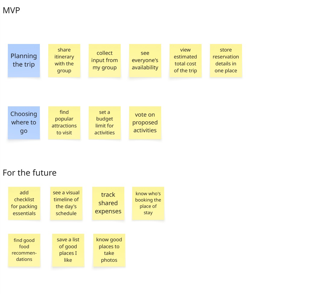
MVP from my User Stories and future features to be iterated.
Creating user stories helped me realize that not all features are equally important, or at least not right away. While it was tempting to design a fully-featured product, users are primarily looking for solutions to their immediate problems: coordinating with others and deciding on destinations. Design these user stories pushed me to focus on the essentials first and build a foundation that can support more advanced features later.
User Flow
Creating a user flow allowed me to visualize how each screen connects to one another. By focusing on the two MVP paths, I chose one key feature from each group to start the flow with, which gave me a strong foundation to build from. The two features I chose were “propose activity to group” and “storing reservation details and editing them”.
While designing the user flow, I realized that in order for me to create a successful user flow, I had to understand the user’s mindset during each step of the process. It’s not just about moving from screen to screen, I had to think about what a typical user would do, what decision they will make, and how to make the interaction as smooth as possible for them.
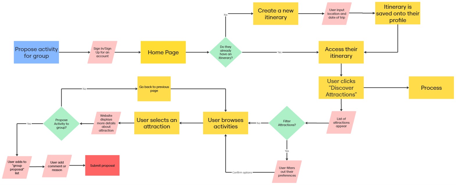
User Flow for the MVP: Propose Activity for Group
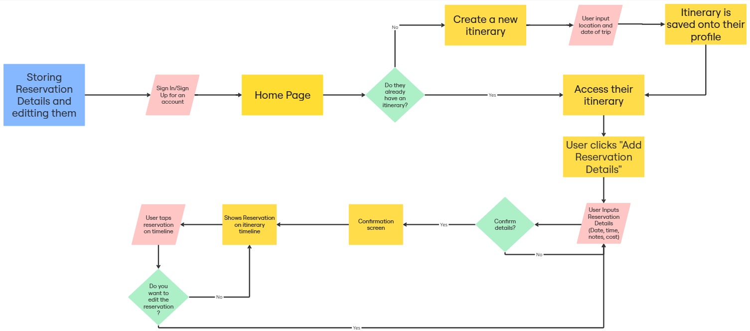
User Flow for the MVP: Storing Reservation Details and Editing them.
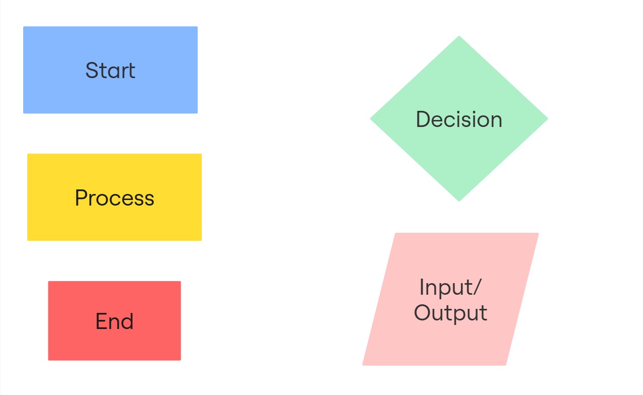
Key/Legend for each represented shape.
Design
After diving deep into the research and uncovering what users truly needed, I felt ready to start imagining how those insights could take shape. I began with hand-drawn sketches, using them as a quick, intuitive way to experiment with ideas and explore how the app could better support users in planning their trips.
Sketches
Sketching out my application first allowed me to visualize possible solutions based on the user's needs and wants. This has helped me quickly experiment with different layouts and user flows before committing to anything high-fidelity. Sketching made it easier to think through design decisions, get feedback, and refine the overall structure of the app in a low-stake environment.
The result are hand-drawn wireframes that mapped out the basic structure of the app. With help from mentor feedback directly on the sketch, I identified areas to simplify navigation, improve feature placement, and prioritize clarity in the user flow.
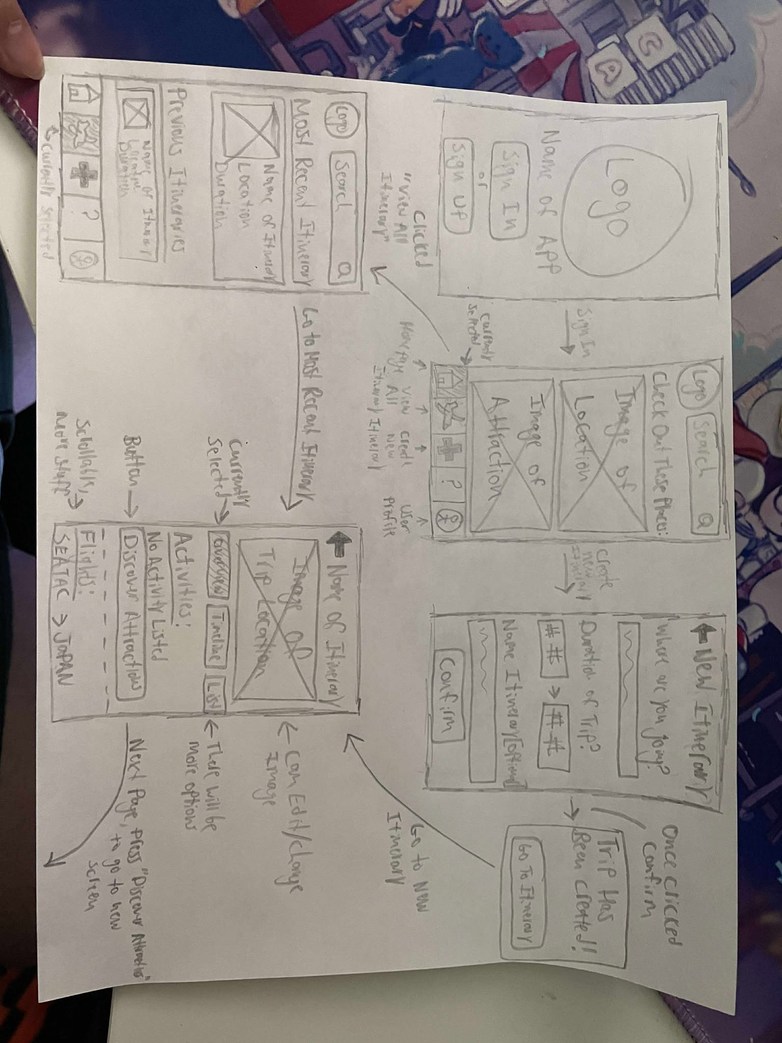
Sketches of GottaGo including the homepage, main itinerary screen, and more.
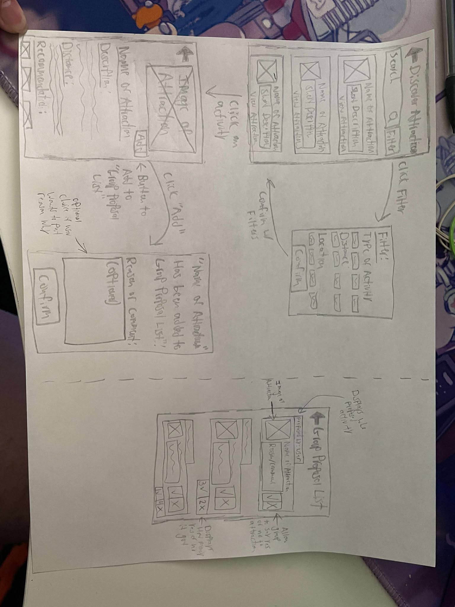
Sketches of GottaGo including the attractions page, group proposal list, and more.
Validation
Sketching helped me imagine possible solutions, but I knew that seeing users interact with the product would tell me so much more. To bridge that gap, I created interactive prototypes and conducted usability tests, turning assumptions into real feedback and improving the experience with each iteration.
After receiving feedback on my sketches, I created a low-fidelity prototype to start visualizing the app’s core features and layout. This version focused on functionality rather than visuals, allowing me to see how different screens would connect and flow.
Creating a low-fidelity prototype allowed me to focus on the structure, navigation, and user interaction of the app without getting distracted by the design aesthetics. It was also a helpful way for me to get feedback and make quick iterations based on usability.
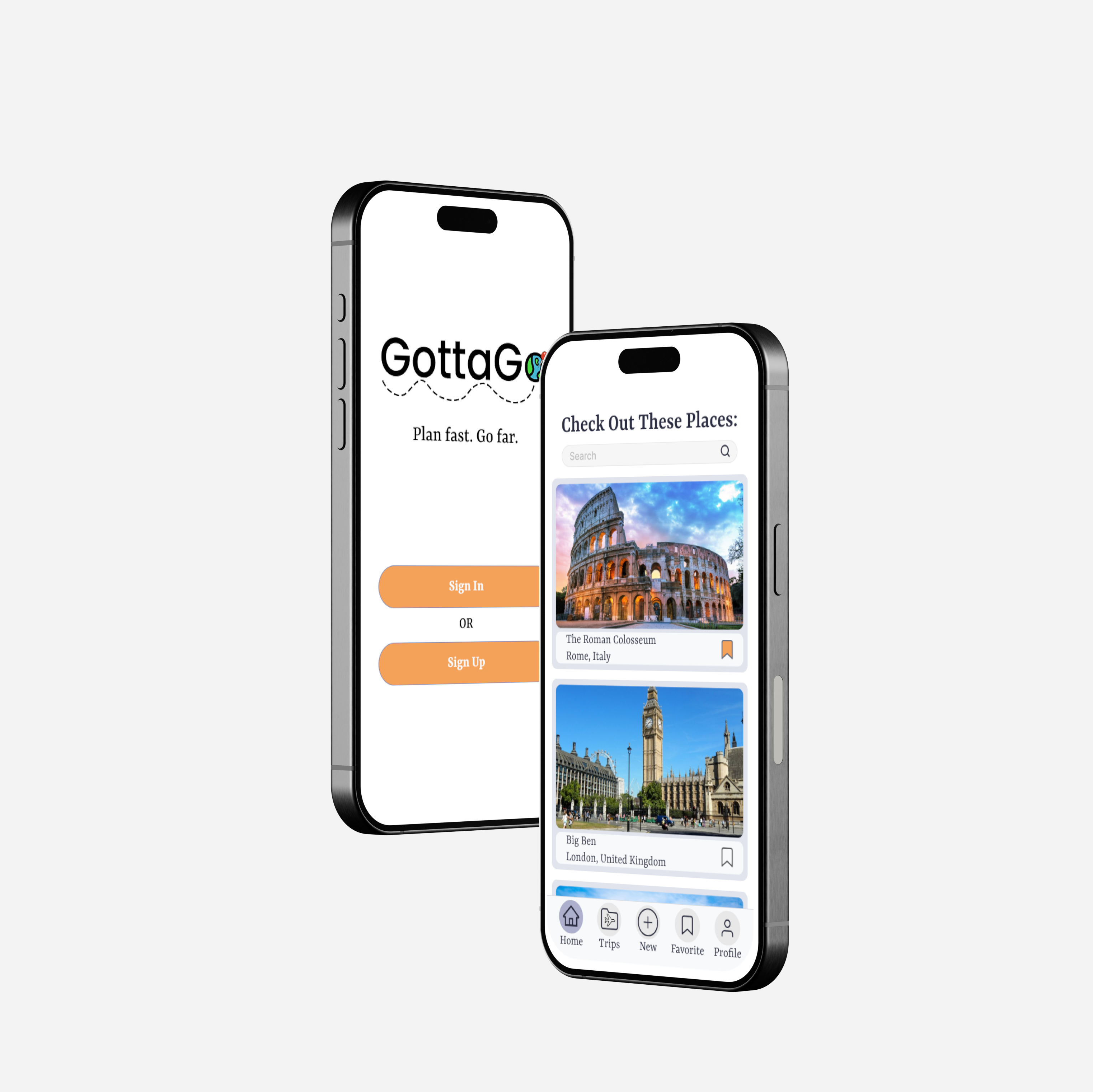
High Fidelity Prototype
Using the feedback from my low-fidelity prototype, I developed a high-fidelity version of the itinerary planning application. This version included visual design elements such as color, typography, and icons to bring the product closer to a real, usable interface.
The high-fidelity prototype allowed me to simulate the actual user experience more accurately and evaluate how visual hierarchy, usability, and design choices support the user’s goals. This was also the version I used for usability testing, so it was important that the interface felt realistic and intuitive for my participants.
Interactive Prototype
Interactive Prototype for GottaGo.
Usability Tests
I conducted two rounds of usability testing with a total of six participants to evaluate the functionality and user experience of my high-fidelity prototype for GottaGo. Each user was given a set of tasks, such as creating an itinerary, adding activities to a group proposal list, entering expenses, and editing reservations. The first three users tested the initial version of the high-fidelity prototype. I then made design revisions based on their feedback and ran a second round of testing with three new participants.
Usability testing helped me validate my design choices with real users and uncover usability issues that weren’t obvious during the design phase. By observing users interact with the app, I was able to identify both friction points and areas of delight. This feedback was critical in helping me prioritize improvement and refine the user flow.
From the usability tests, I learned several important things:
• Swipeable Tab Bar Confusion
○ Most users, across both testing rounds, had trouble recognizing that the tab bar was swipeable, even after I added a visual indicator. While some users accidentally discovered it, others suggested more explicit solutions like a hamburger menu or an expandable list of tabs.
• Lack of Negative/Neutral Option in Group Proposal List
○ Multiple users questioned the absence of a “thumbs down” option for proposed activities. While I initially left it out to avoid conflict among group members, one tester suggested providing an alternative way to reject or express disinterest in activities.
• Disconnected Screens: 'Add Activity' <-> Group Proposal List
○ A couple of users found it inconvenient to return to the Group Proposal List after adding an activity, and vice versa. They recommended a quick-access button between the two screens to optimize the task flow.
Reflection and What is Next
Designing an itinerary app for group travel planning challenged me to think more deeply about the wide range of user needs and expectations. What works for one person might not work for another, especially when different planning styles and comfort levels with technology are involved. This project pushed me to stay flexible, iterate often, and find thoughtful ways to bridge those differences through design.
One of the biggest takeaways from this project was realizing how much clarity and small interface cues can impact the overall user experience. Even something as simple as an icon or swipe gesture can be misinterpreted without the right visual feedback. These usability tests helped me understand how important it is to not just make a feature functional, but also intuitive and easily discoverable for users with varying levels of tech familiarity.
One unexpected lesson I learned through usability testing was how even small interface decisions can impact a user’s experience in big ways. What felt intuitive to me, like the swipeable tab bar, often didn’t translate well to my users. These moments allowed me to realize how important it is to test these features and not make any assumptions. It pushed me to think more critically about not just how something looks or functions, but how it’s actually perceived and used in a real-world scenario.
If I had more time, I would take feedback from my second usability test and fix those issues. Also, I would finish designing the other screens for the many other features that I would want to implement into my app. But most of all, I would keep conducting more tests because no matter how perfect you think your app is, there can always be room for improvement.


.png)