UX/UI Designer for employHER

"employHER is first of its kind - a talent intelligence video platform for women and gender diverse people to connect and network with each other. employHER video profile adds a level of trust and familiarity to your network. Apply for jobs with your employHER video profile, showcasing your personality, soft-skills, experience and personal branding." - employHER
Website |
LinkedInOverview
Timeframe: 12 months
Role: UX Designer
Tools: Figma, Slack, Trello
Team Member: Danny Truong, Pranav Patel
Understanding My Role and Project Goal
Understanding My Role:
Upon joining employHER as a UX/UI Design intern, I found myself without any immediate assignments for the first few weeks. To stay productive, I took the initiative to explore the company's Figma prototype of their website. While studying its various pages, I noticed that the website's design system was not fully developed, and the messaging page was also empty. I proactively reached out to my boss and expressed my interest in adding more to the design system and designing the messaging screen. My boss not only agreed but also tasked me with incorporating a feature that would allow interviewers and interviewees to schedule meetings as well.
Project Goal:
1. Create more components to add into the design system to help reflect the branding of our company
2. Design a high-fidelity wireframe for the messaging screen and scheduling screen for our users
Competitive Analysis
To better understand how employHER could differentiate itself from building out its networking and messaging features, I analyzed three competitors: LinkedIn, Facebook Messenger, and LettuceMeet. Each offered relevant insights into professional networking, communication, and scheduling.
LinkedIn: As the leading professional networking platform, LinkedIn provides job listings, company pages, and profile-based recruiting. However, its focus is broad and text-heavy making it harder for underrepresented candidates stand out . In contrast, employHER highlights video-based profiles centered on women and gender-diverse professionals, making this experience more inclusive and unique.
Facebook Messenger: Known for its intuitive chat experience, Messenger served as a model for designing employHER's direct messaging feature. While Messenger is great for usability and real-time engagement, it lacks a professional context. EmployHER has the opportunity to integrate a messaging system that is both approachable and professional, encouraging authentic employer-candidate conversations.
LettuceMeet: An efficient scheduling tool that quickly identifies overlapping availabities across users. This inspired the scheduling feature within employHER's messaging platform, allowing employers to easily invite candidates to online interviews or meetings.
Key Insights:
1. Candidates need a platform that feels both professional and approachable. Somewhere they can trust to find a reliable job.
2. Integrating messaging + scheduling within one platform reduces friction and supports smoother interview processes.
3. None of the competitors center women and gender-diverse individuals in their core design. employHER can position itself not just as a hiring tool but as a safe, empowering community.
User Flow
Once I had a better understanding of what features and components I wanted to implement into my design, I started brainstorming how I wanted the two screens to look. To better understand how I wanted my users to interact with the webpage, I decided to make a user flow chart to figure out what features the page will have and how I want the users to interact. I realized that there would be two types of users: the interviewer and the interviewee. They were both similar, yet different at the same time.
Interviewer's Perspective

Interviewee's Perspective

Design Systems
Once I established the user flow and understood how each page should connect, the next step was expanding the design system to support those interactions. At the time, EmployHER did not have a header or footer, so I created components that aligned with the company’s brand. I aimed to make them professional, approachable, and easy to navigate. These elements not only provided consistency across the site but also improved usability by giving users clear access points to key features.

Early Sketches
With the foundational components in place, I shifted my focus to visualizing how they could come together on the page. I began with rough sketches to map out the overall layout and structure, experimenting with different ways to arrange content while keeping the flow intuitive and aligned with the brand. These early sketches served as a low-fidelity starting point, allowing me to quickly explore ideas before moving into more detailed wireframes.
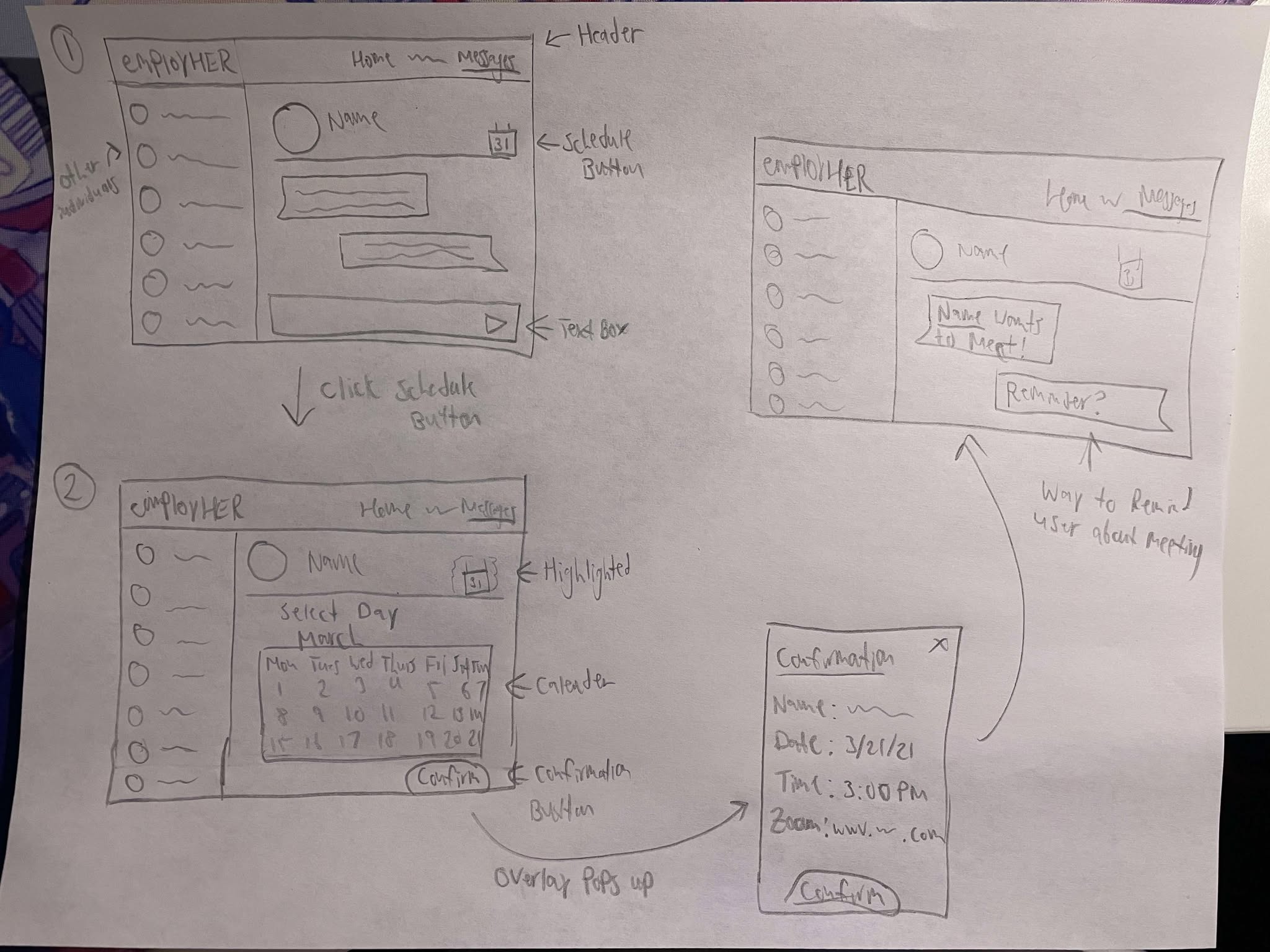
Low-Fidelity Wireframes
After sketching out the initial layout ideas, I moved into Figma to translate those concepts into low-fidelity wireframes. This step allowed me to refine the structure, establish hierarchy, and focus on functionality without getting distracted by colors or visuals. The wireframes also made it easier to test different layouts quickly and ensure that the design system components fit seamlessly into the overall flow.
Feedback and More Iterations
At the team meeting, I showed my initial wireframe to everyone, and they gave me valuable feedback to enhance my design. My boss suggested that I change the background color to match the website's theme, while someone else recommended that I add an option for the interviewer to choose between voice or video calls. Several other people offered suggestions, and I took note of all of them to improve my design for the next prototype, which I have included below.
High-Fidelity Wireframe
As I was presenting my second high-fidelity prototype to the team and receiving additional feedback, a new lead designer named Pranav joined our team. While I retained the majority of the tasks for the webpage, Pranav offered valuable advice and suggestions, enhancing the quality of my final prototype. Below, I will present the screens from the perspective of each user.
Interviewer's Perspective
Interviewee's Perspective
Reflection
What began as a three-month internship at employHER evolved into a remarkable 12-month journey of professional and personal growth. My exceptional performance as an intern did not go unnoticed, and my boss recognized my potential, prompting my promotion from intern to official UX designer. Despite my invaluable contributions, the time had come for me to say goodbye. Reflecting on this momentous experience, I realize that this marked my first entry into the world of UX/UI design, where I learned valuable lessons, including how to work independently and with a team, how to incorporate constructive feedback, and how to collaborate seamlessly with software engineers. This experience has given me a profound understanding of the daily work-life of a UX Designer and has equipped me with the knowledge and skills to generate new, innovative ideas that benefit not only me but also my organization.